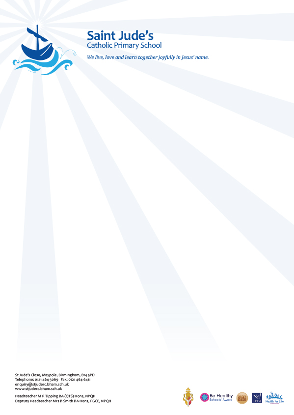
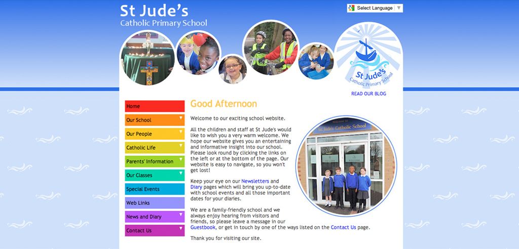
The brief: To create a contemporary twist on an existing and out-dated logo and brand for St. Jude’s Catholic Primary School, Birmingham.
The process: Two Thirds Design researched the story of Saint Jude and the meaning behind the iconography used within the existing logo. We created a clean, contemporary style logo by using a sans serif font. We redrew the classic boat linked with the voyages of the Saint, giving it presence in a background of sun-rays and waves, interpreting the elements from the bible story.
The end result: A modern, crisp scalable logo for St. Jude’s Primary school, supplied in all formats needed – e.g. Print, web, one colour and grey-scale. With the successful brand applied to all stationery elements, we printed a full stationery package including compliment slips, letterheads and note pads, we also provided the staff with a digital Word template in black & white and colour for the school to use electronically.
Client St Jude’s Catholic Primary School Link http://www.stjuderc.bham.sch.uk/index.phpServices Branding, Print & Design Tags compliment slips, letterheads, logo


