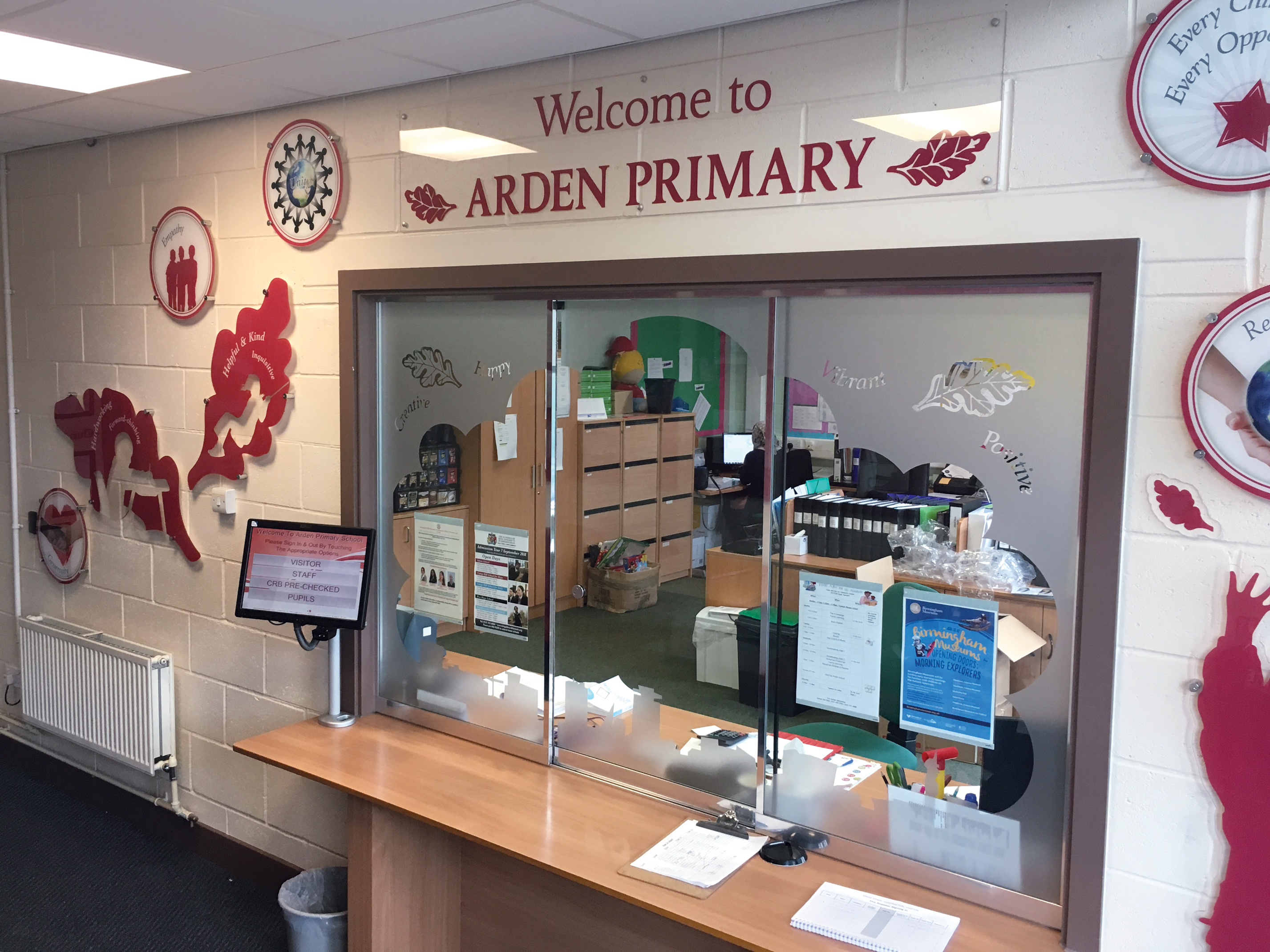
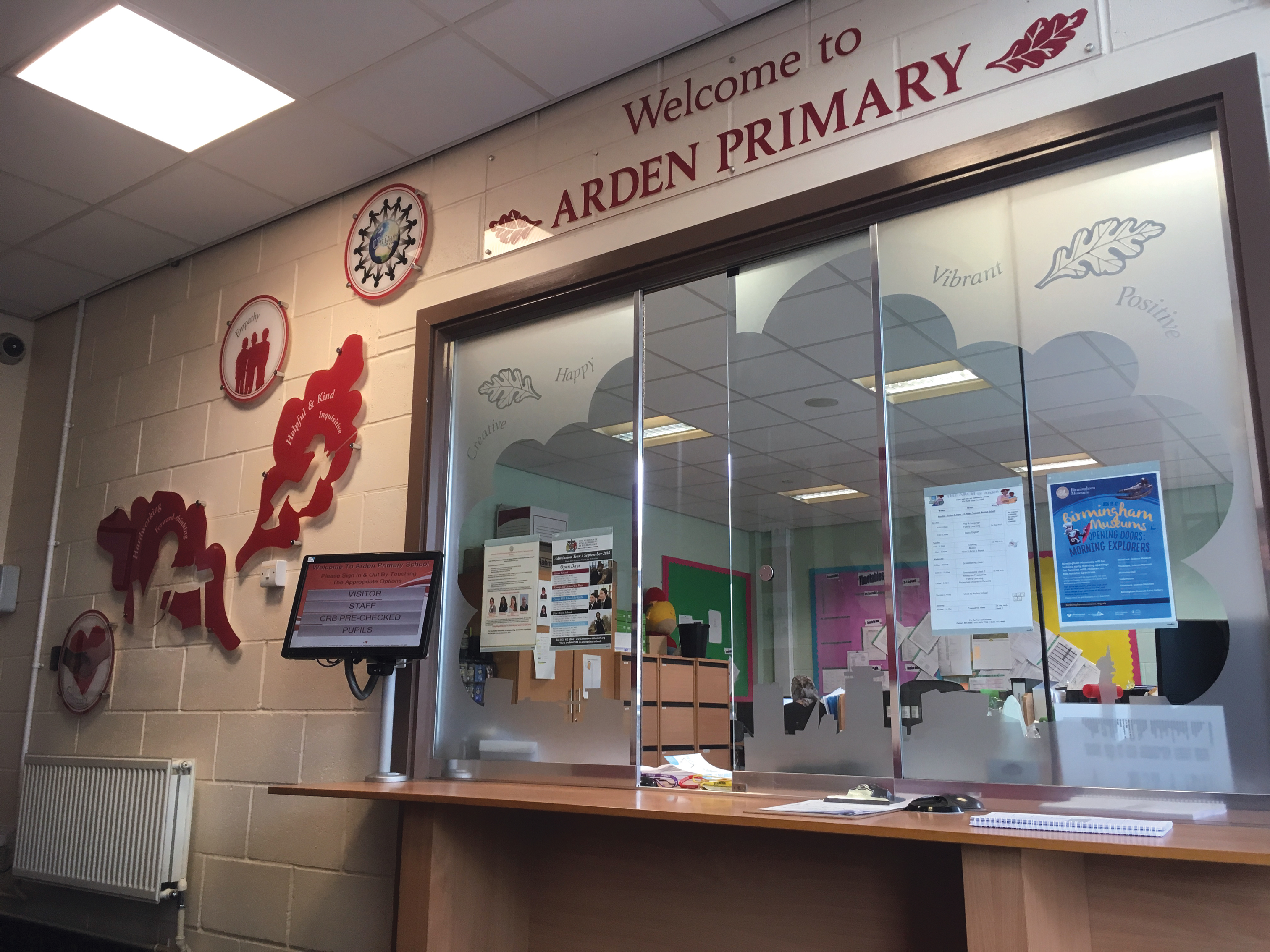
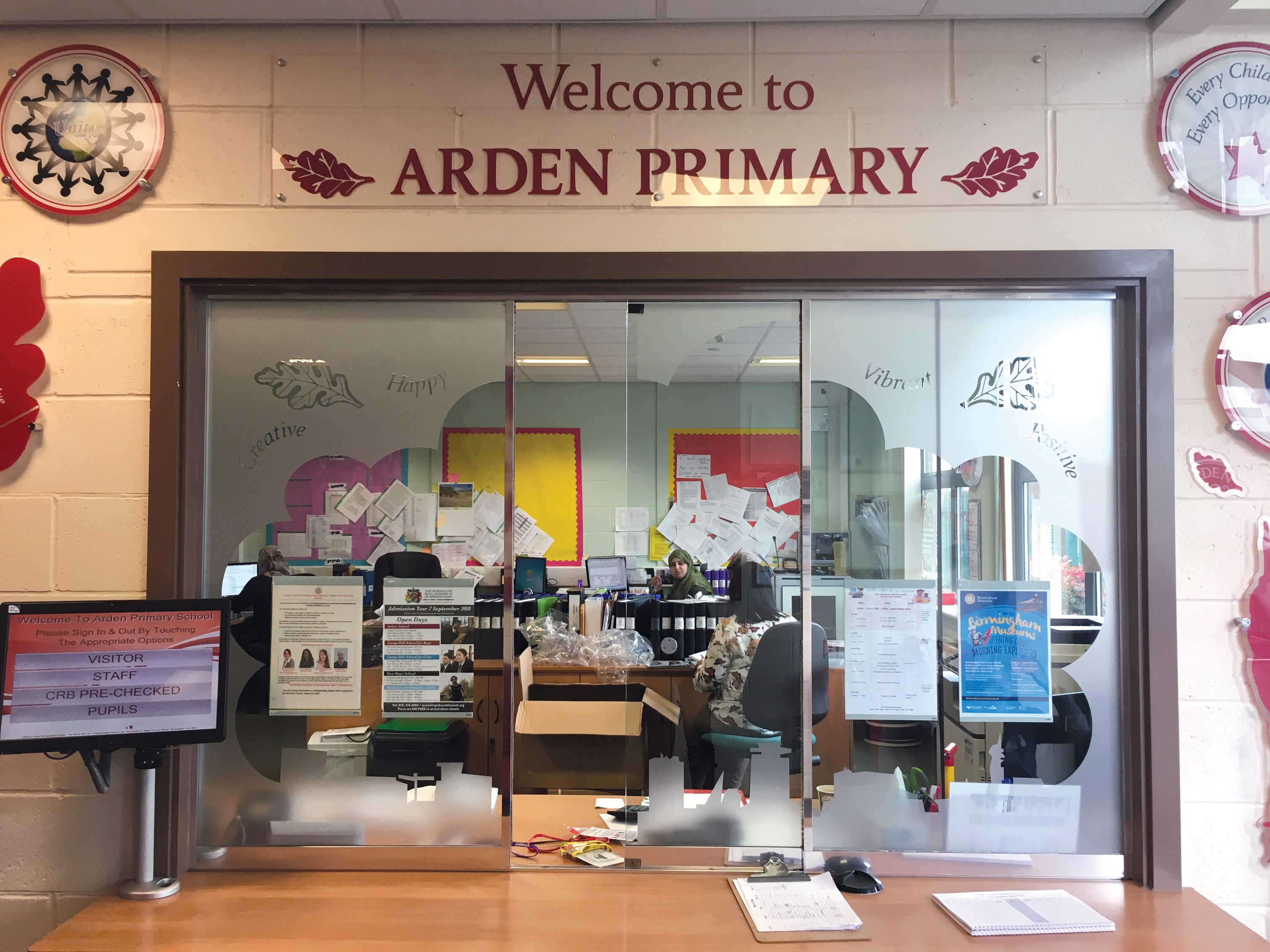
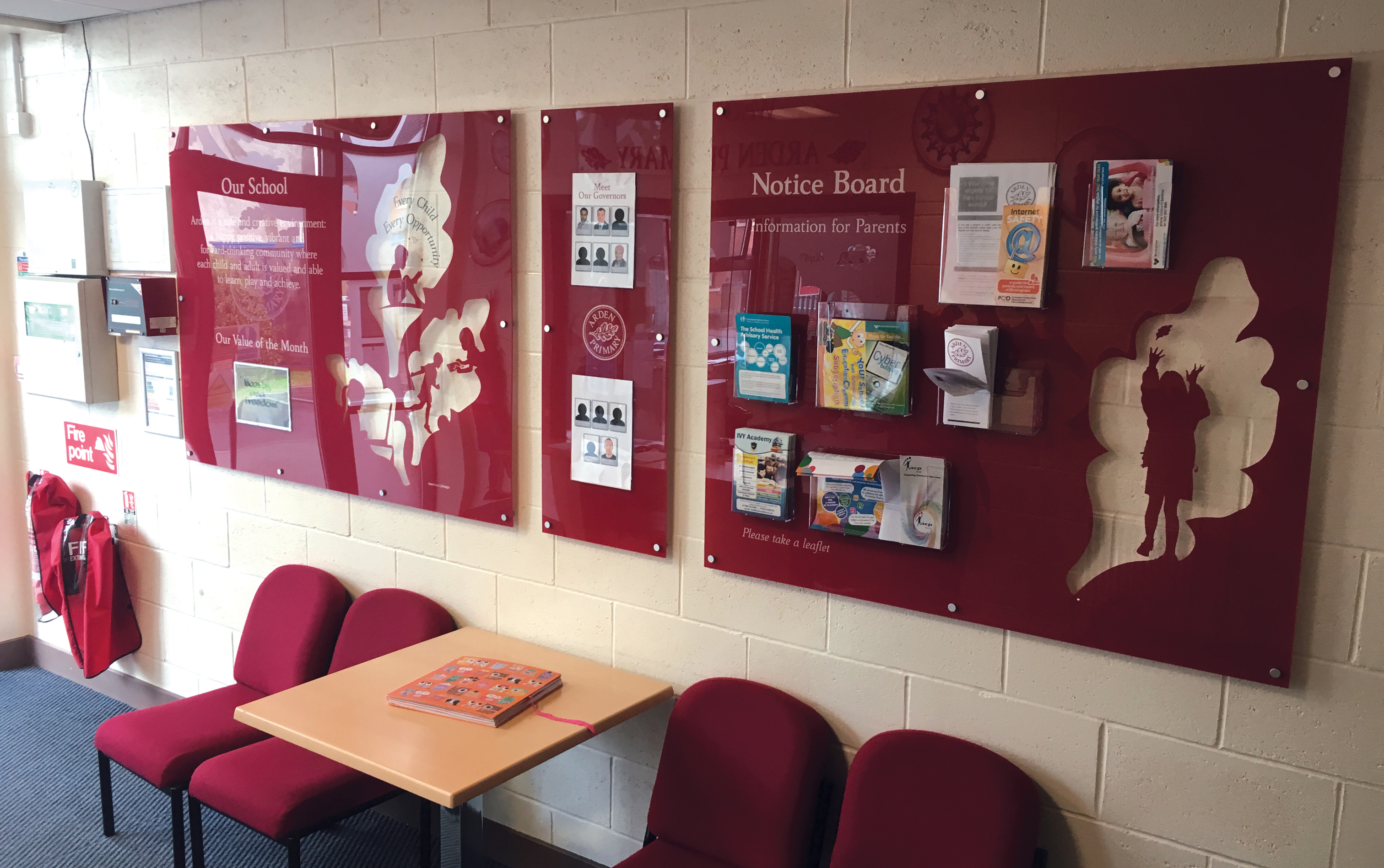
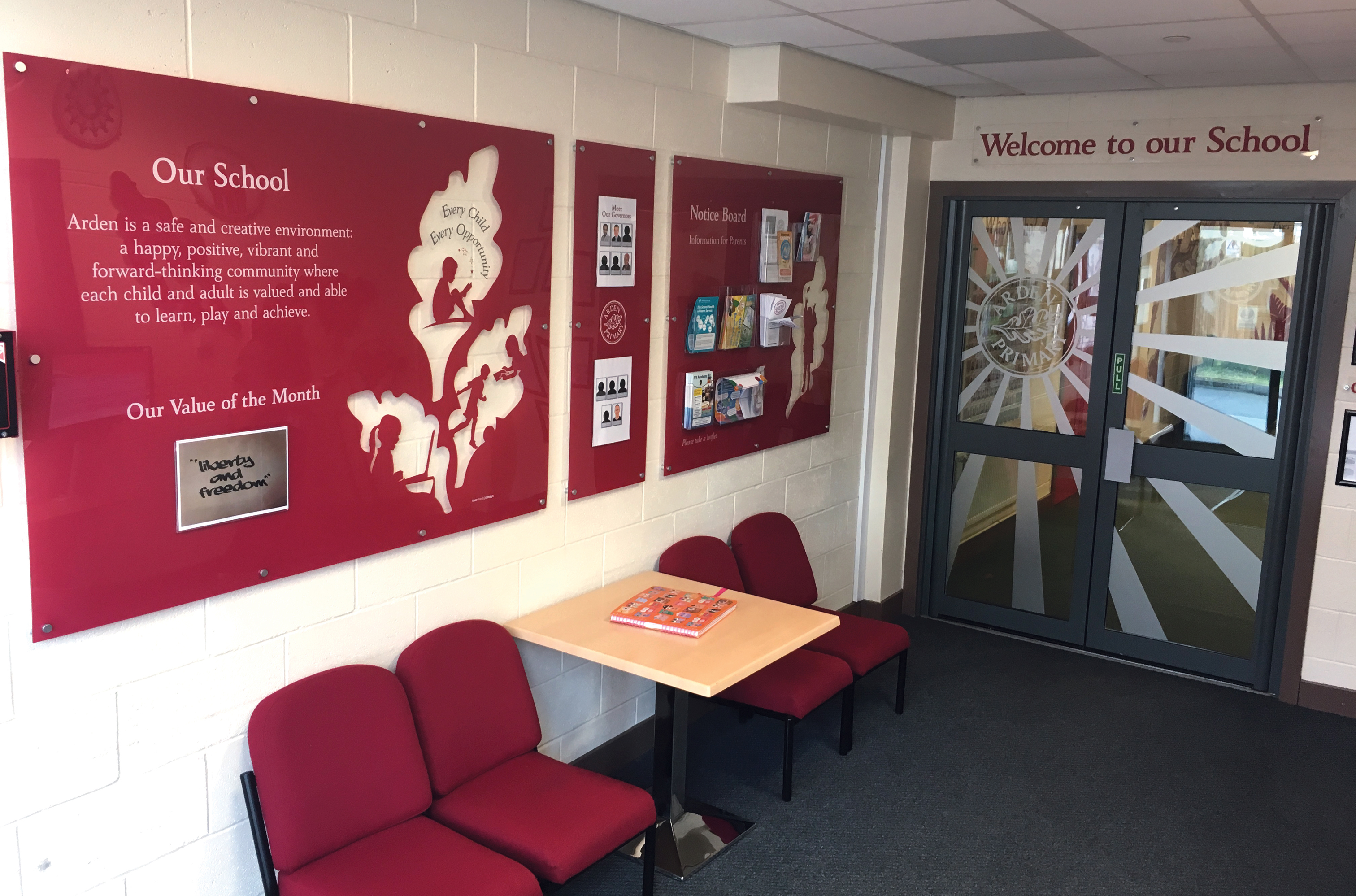
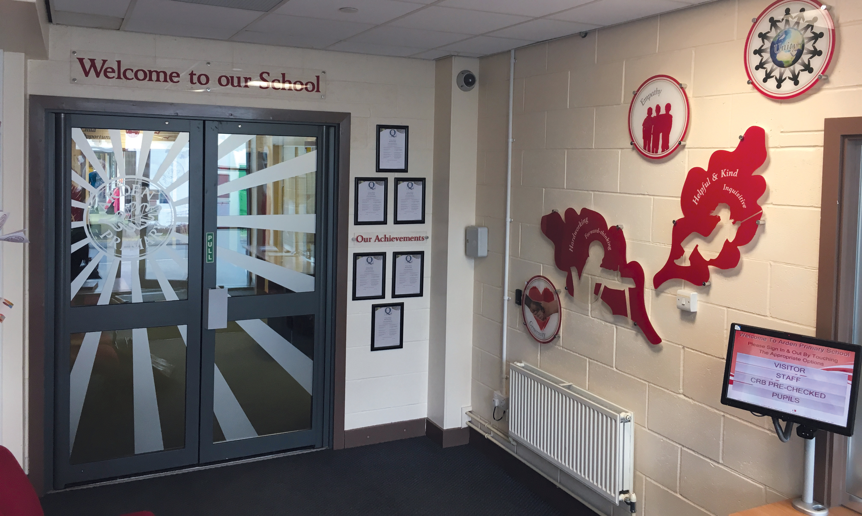
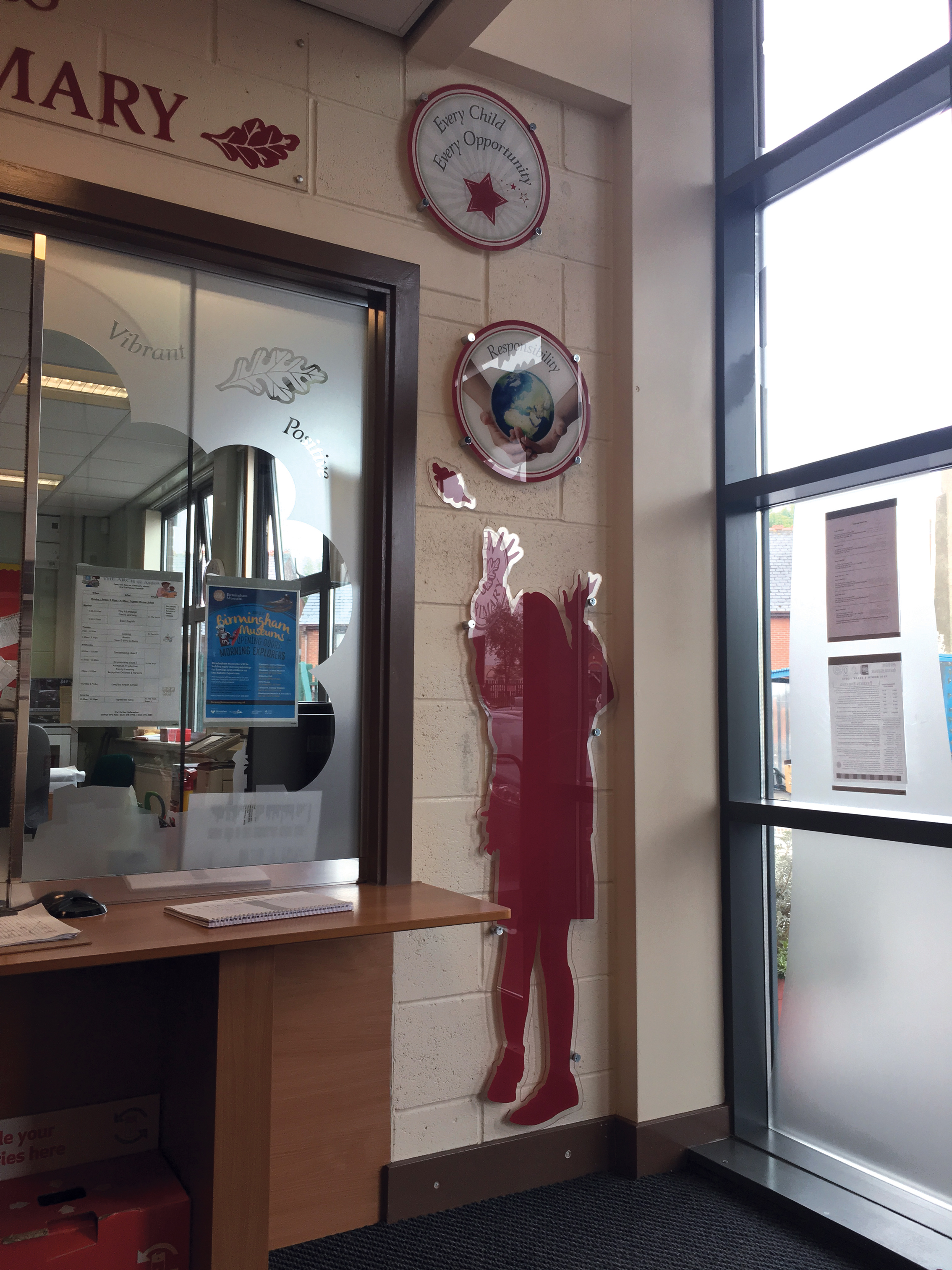
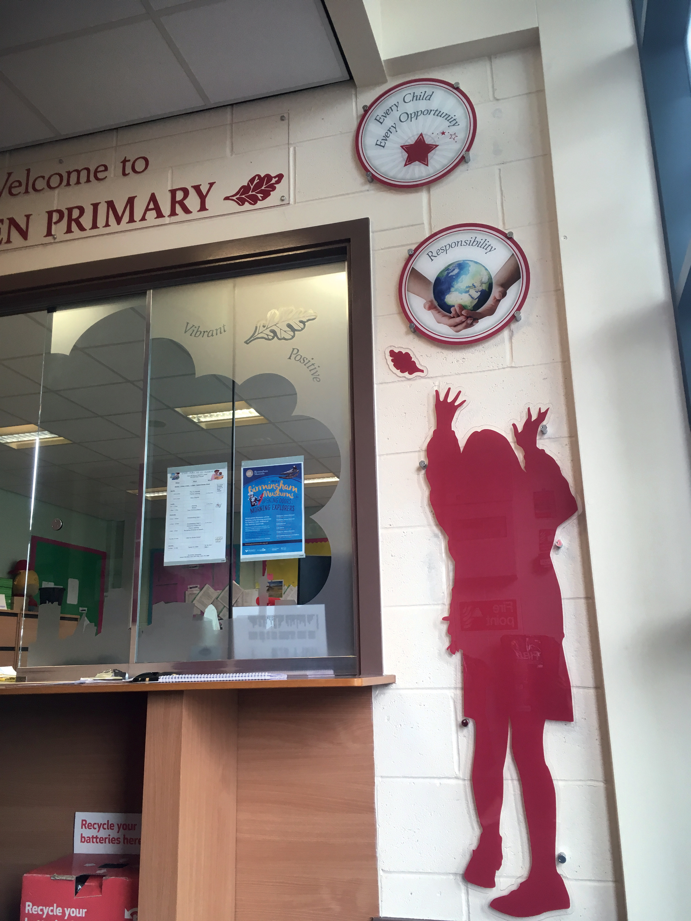
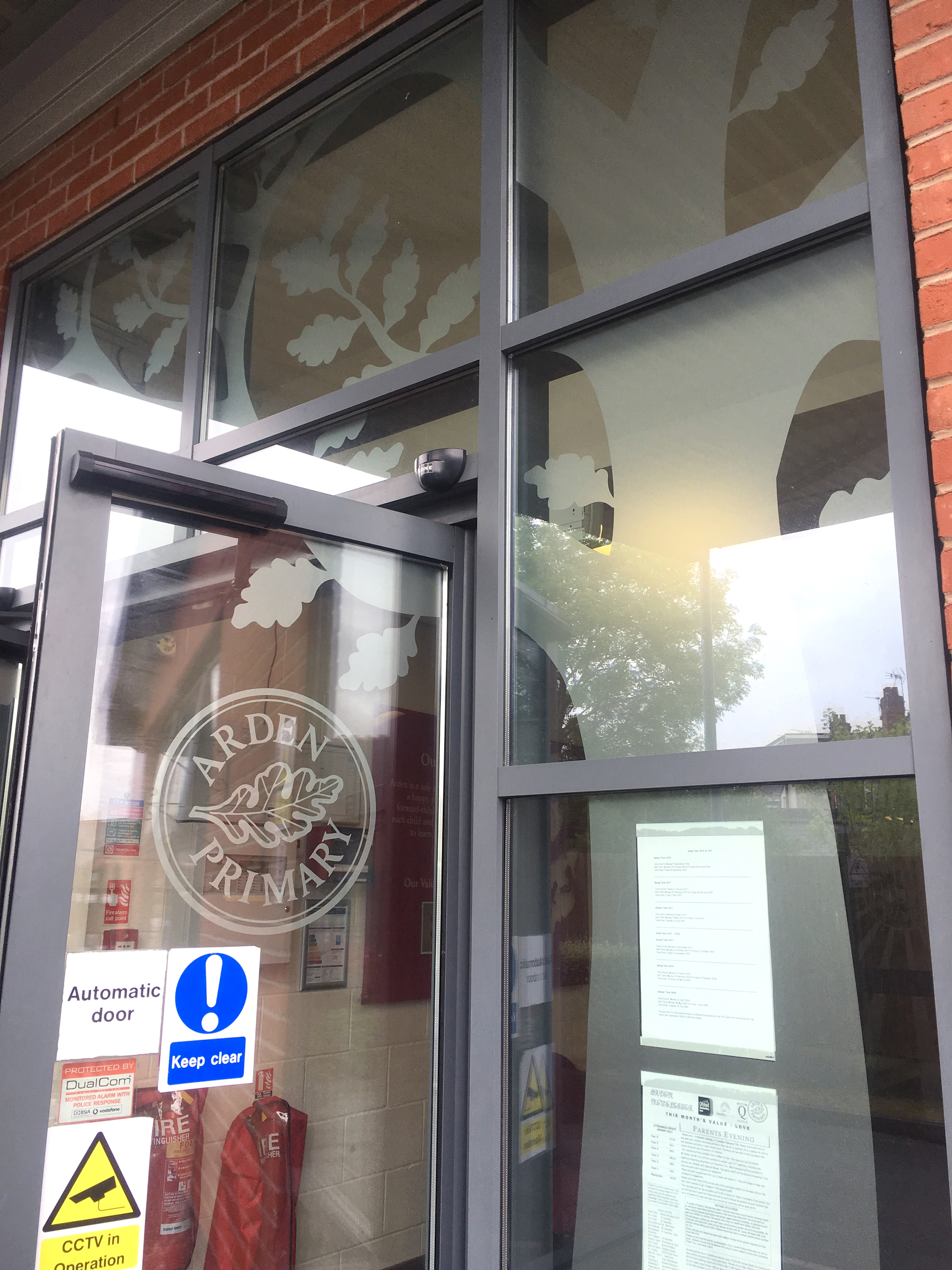
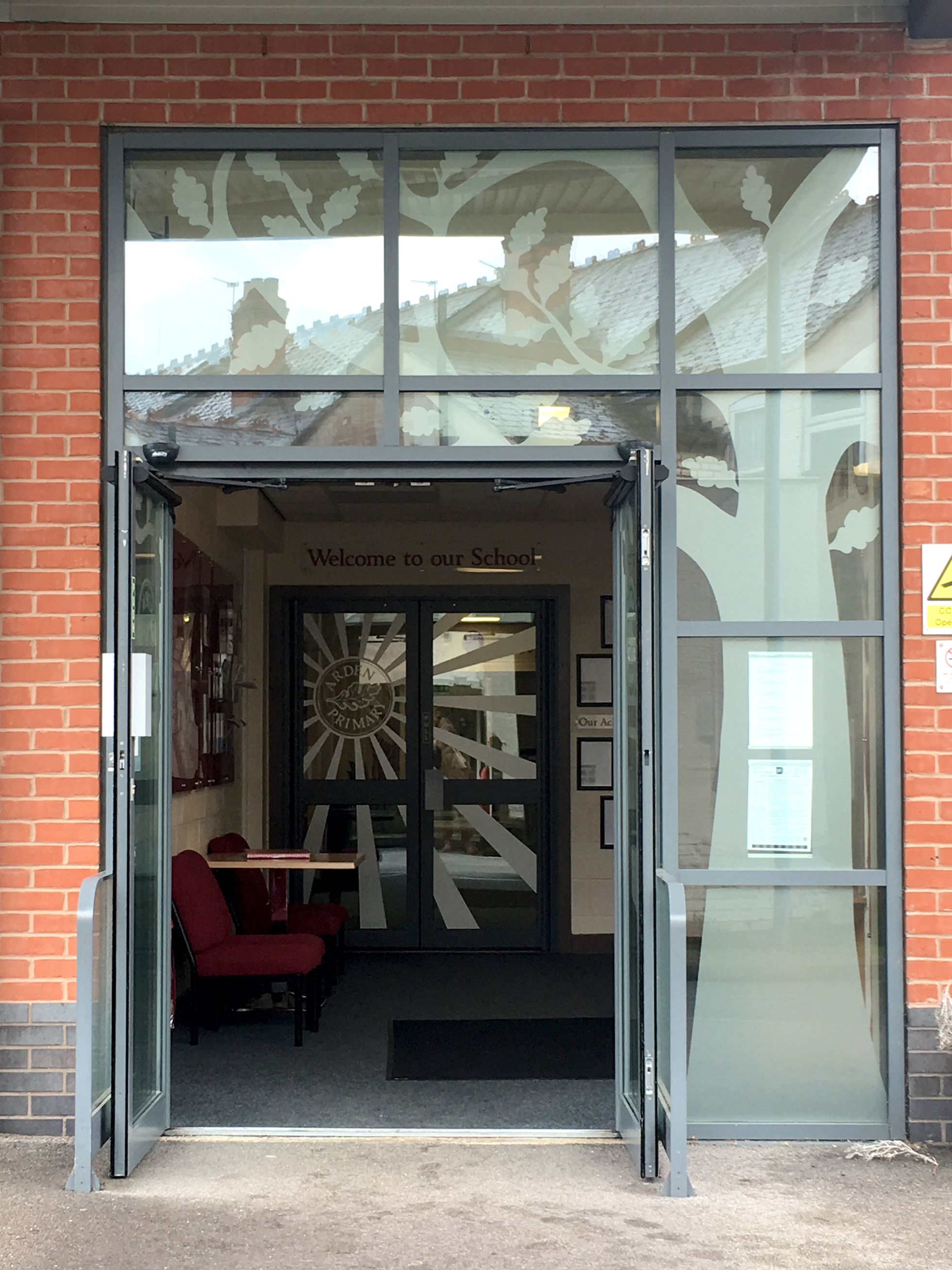
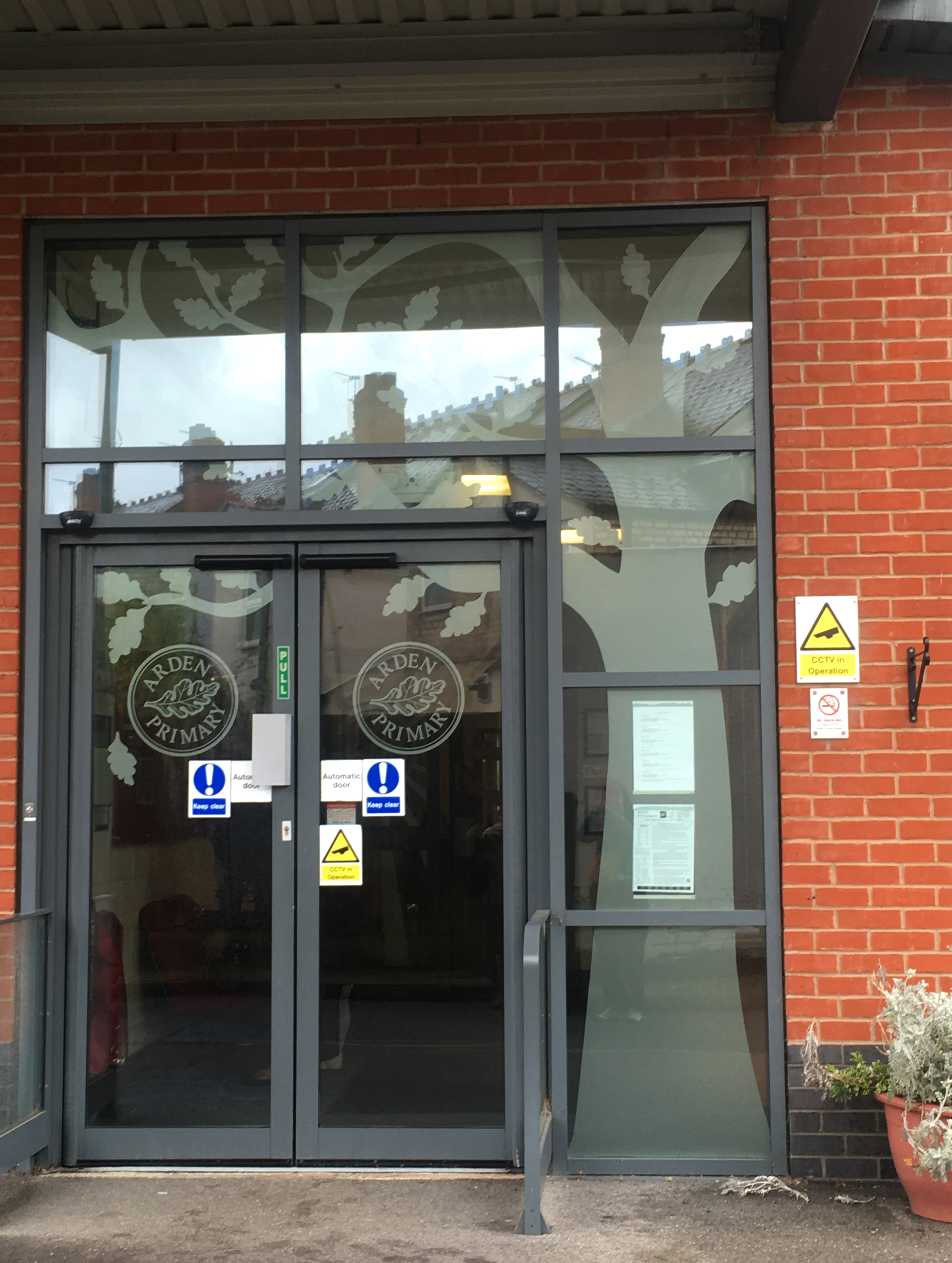
The brief: To create a welcoming entrance that reflects the Primary School’s brand and their core values. To create a little more privacy to the large glass hatch. To tidy up the notices to parents that were currently blue tacked to the windows and walls to produce a professional but friendly entrance.
The process: Two Thirds Design were invited to Arden Primary School to brainstorm ideas for their school interior.
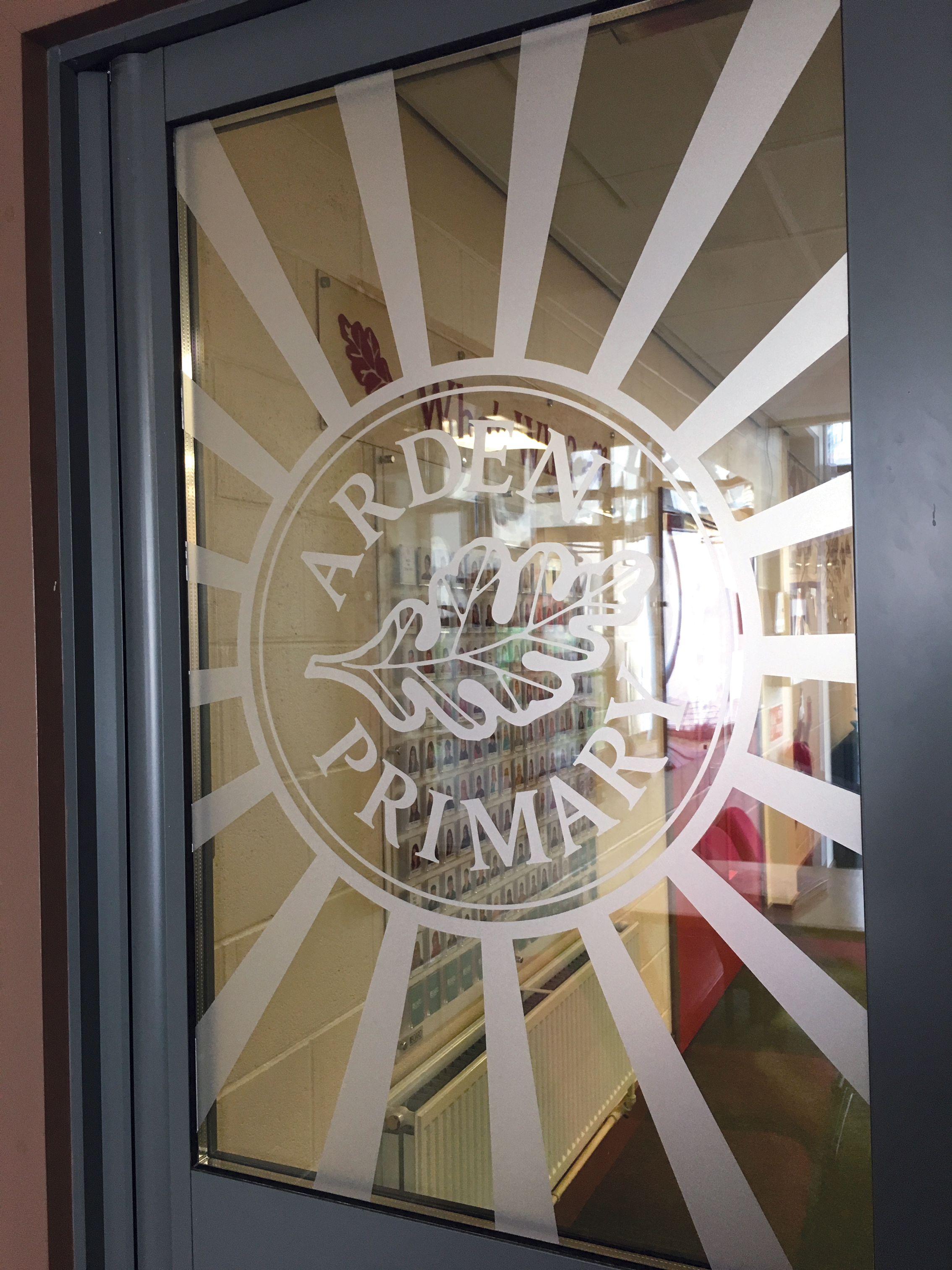
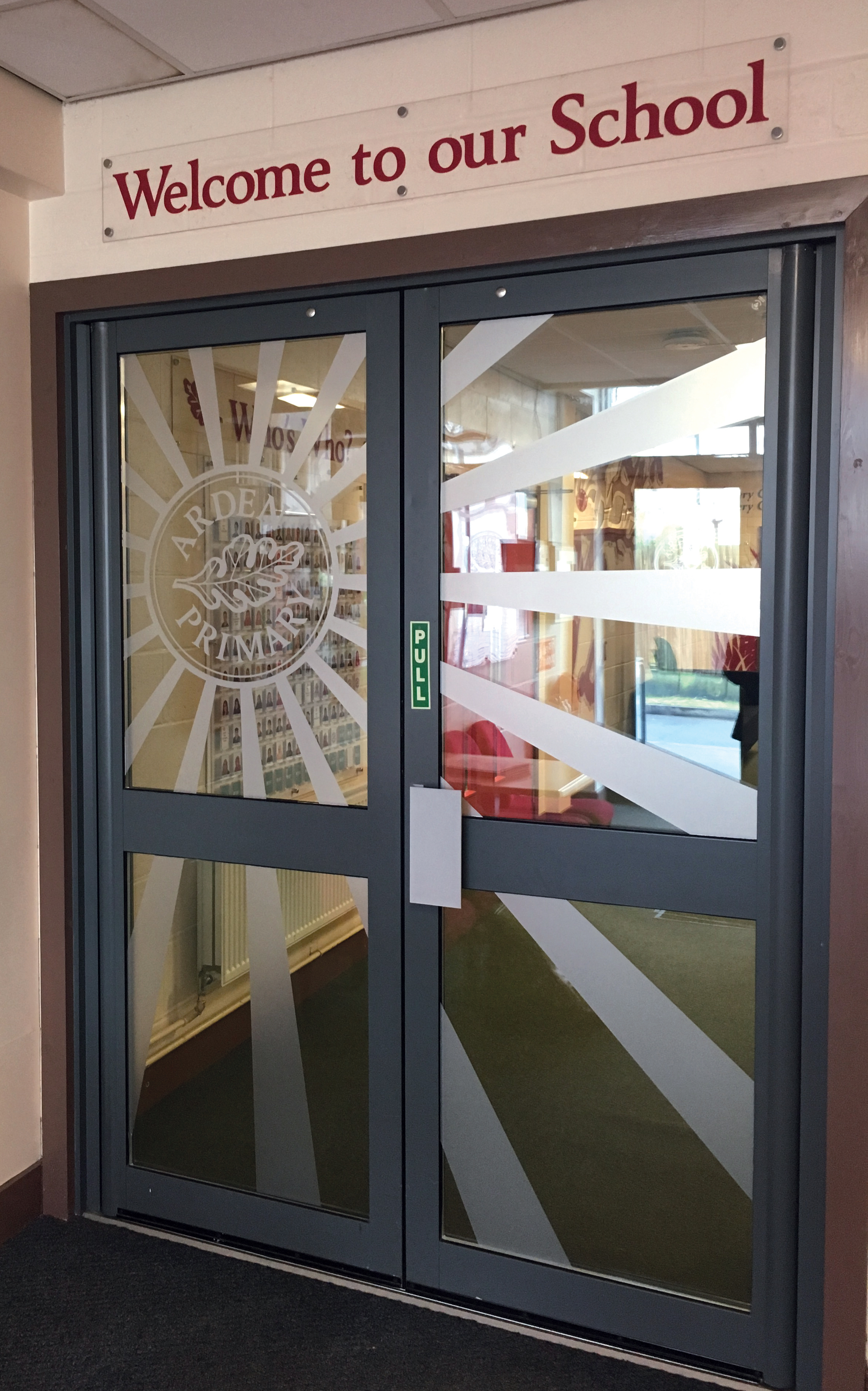
We used the School’s core values, mission statement and existing logo which included an oak leaf to create their window and wall displays.
The end result: The reception hatch was framed with frosted vinyl and acrylic lettering. Wall displays were created from acrylic disks and cut out shapes. The internal and external windows were enhanced with frosted vinyl. We created an updateable governor board by reverse printing on acrylic and mounting acrylic poster pockets to the face. We installed updateable information boards with clear acrylic leaflet dispensers so that the school staff could update notices to parents in a clean easy way.
