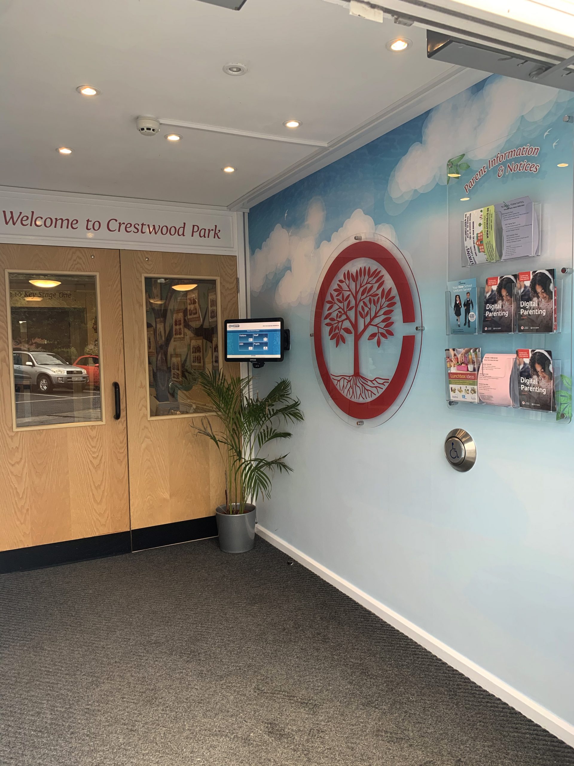
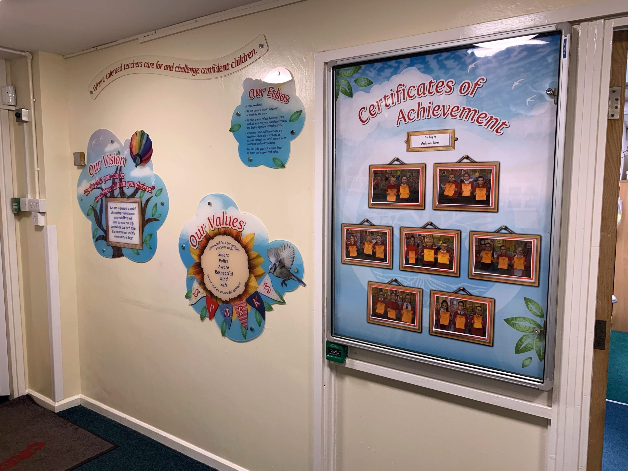
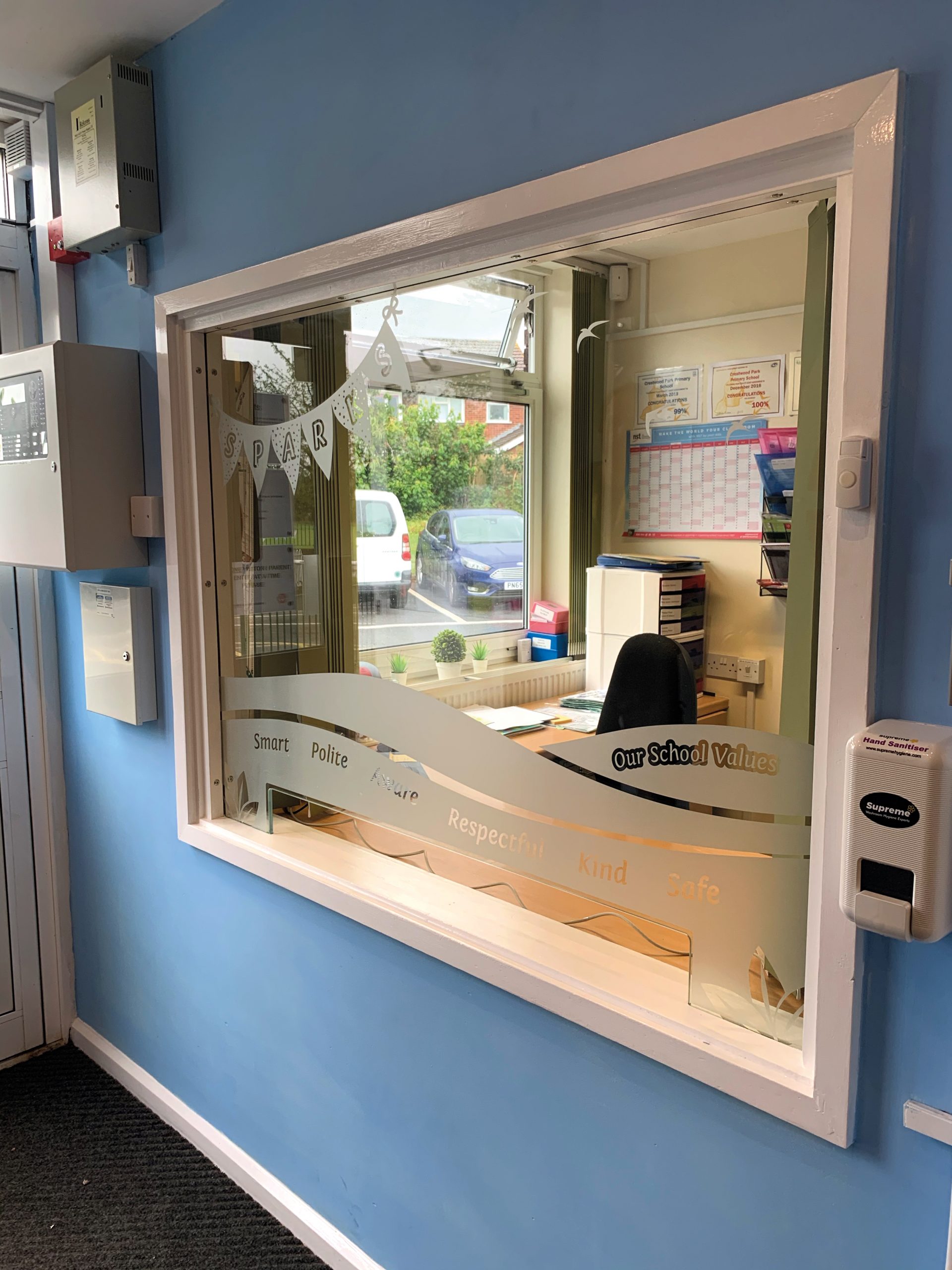
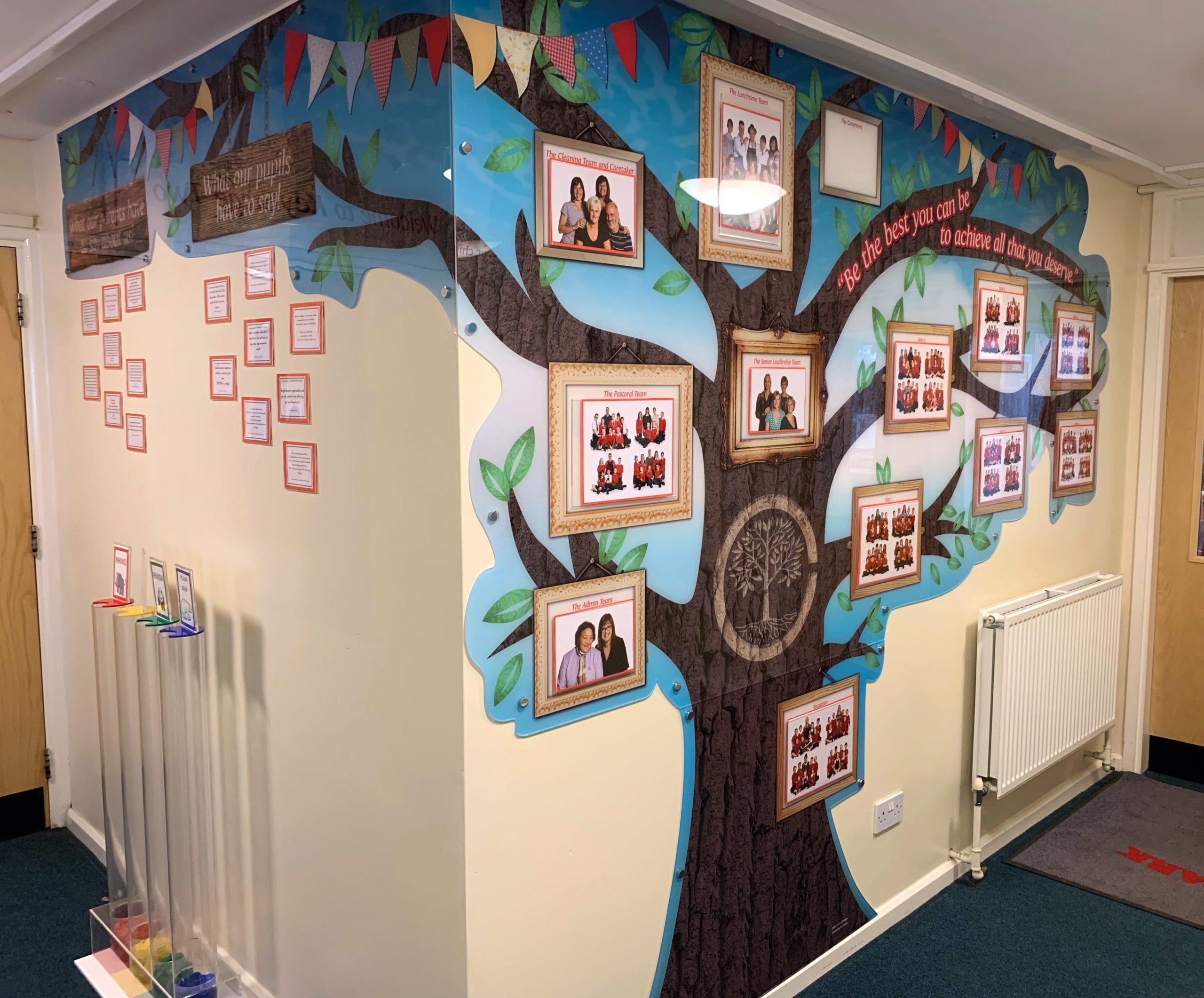
The brief: To create a welcoming entrance that reflects the Primary School’s brand and their core values. To create a little more privacy to the large glass hatch. To tidy up the notices to parents that were currently blue tacked to the windows and walls to produce a professional but friendly entrance.
The process: Two Thirds Design were invited to Crestwood Park Primary School to brainstorm ideas for their school interior.
We used the School’s core values, mission statement and existing logo to create their window, hatch and wall displays.
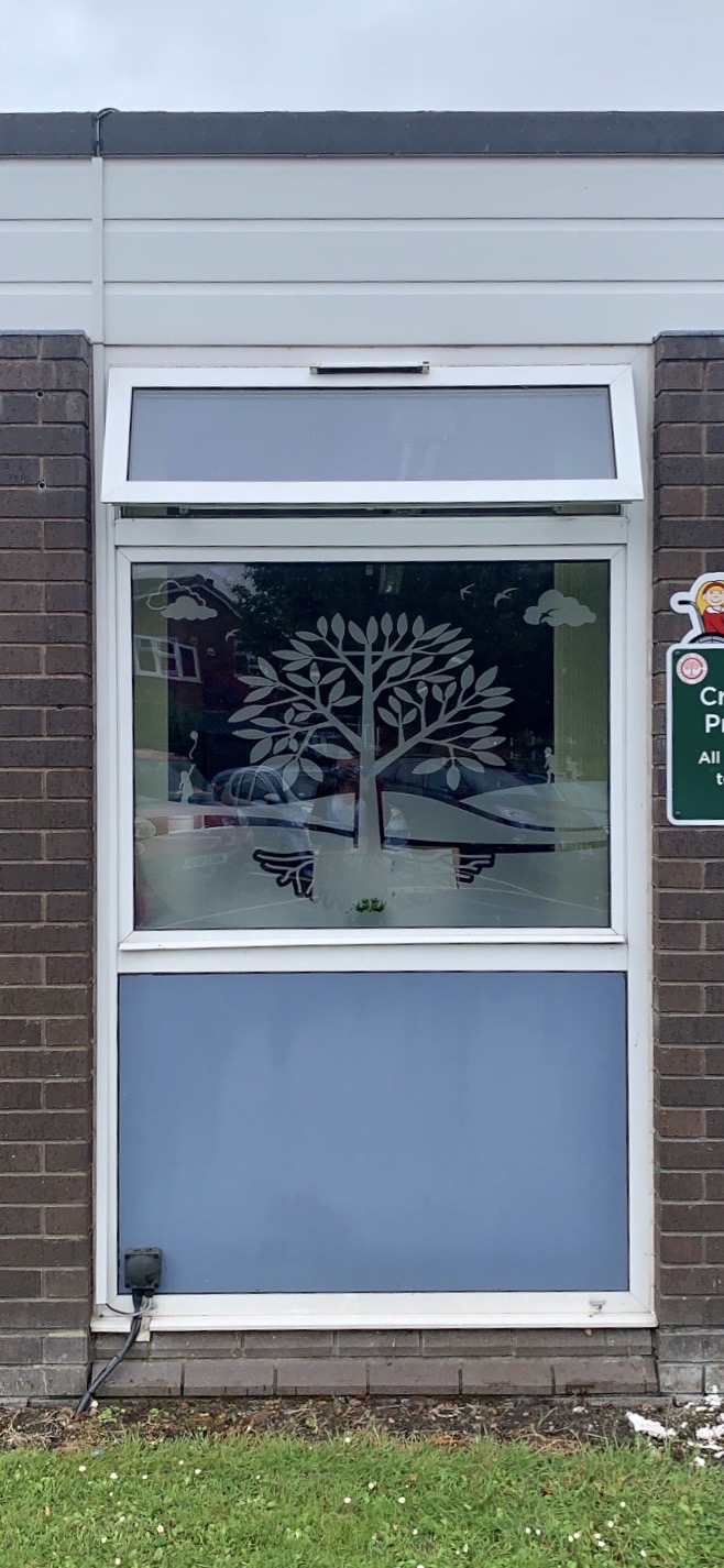
The end result: The reception hatch was framed with frosted vinyl. The updatable ‘Family Tree’ staff and pupil display was created from acrylic with clear poster pockets. The external window was enhanced with frosted vinyl. We installed full wall vinyl covering to the foyer wall and an updatable information board with clear acrylic leaflet dispensers so that the school staff could update notices to parents in a clean easy way.
Client Crestwood Park Primary SchoolServices Branding, Installation, Print & Design Materials acrylic, poster pockets, wall vinyl Tags illustration, information board, leaflet dispenser, montage, wall art, welcome board
