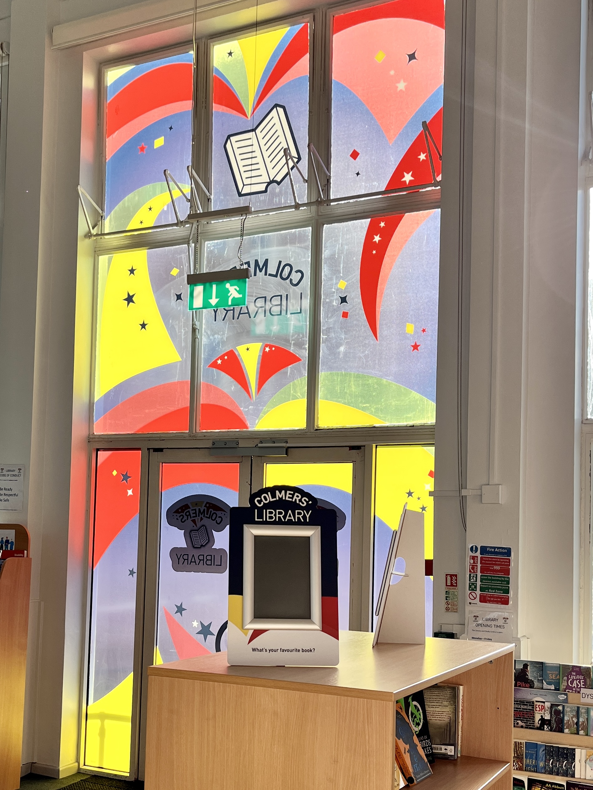
Colmers Secondary – Library
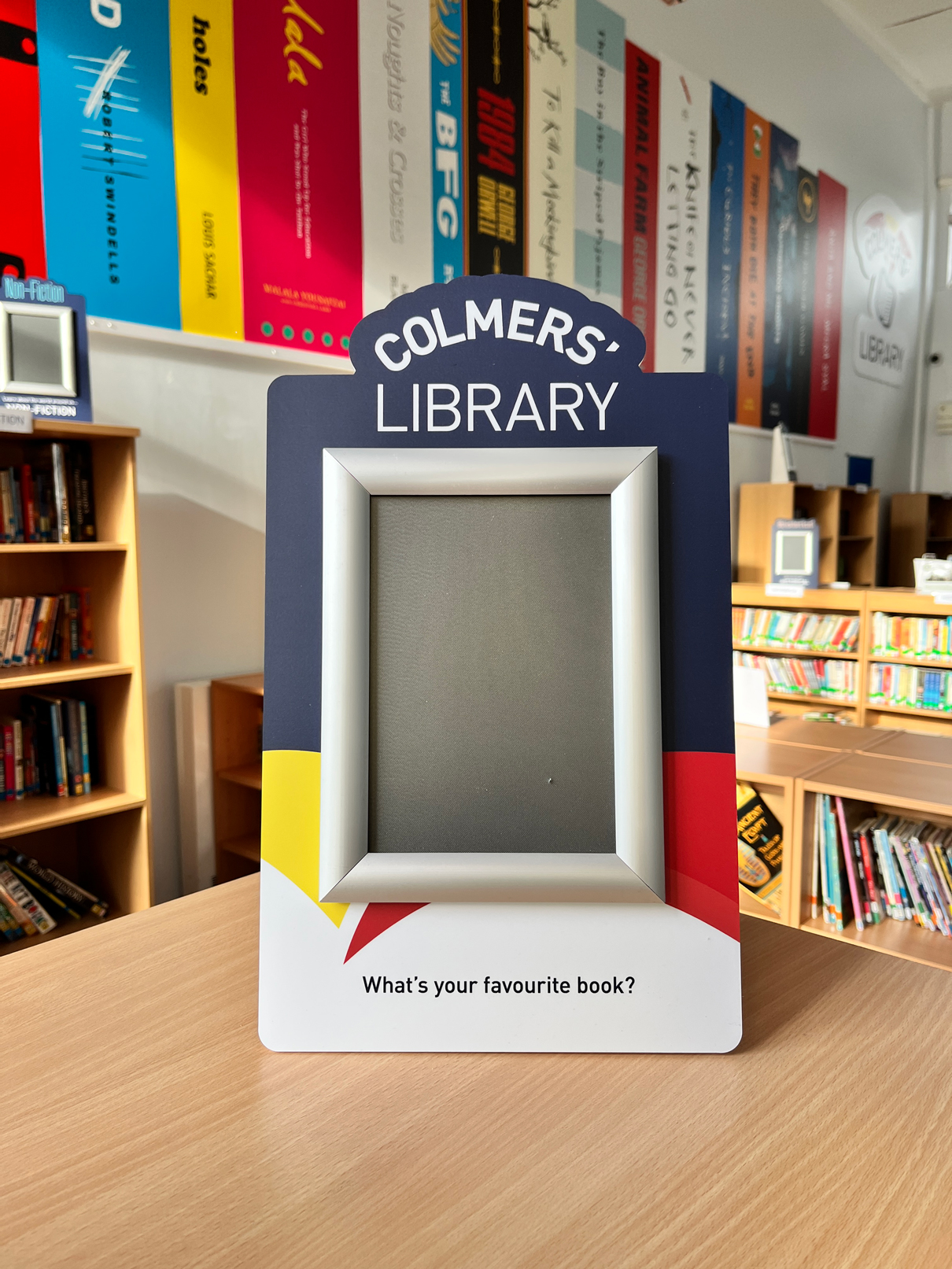
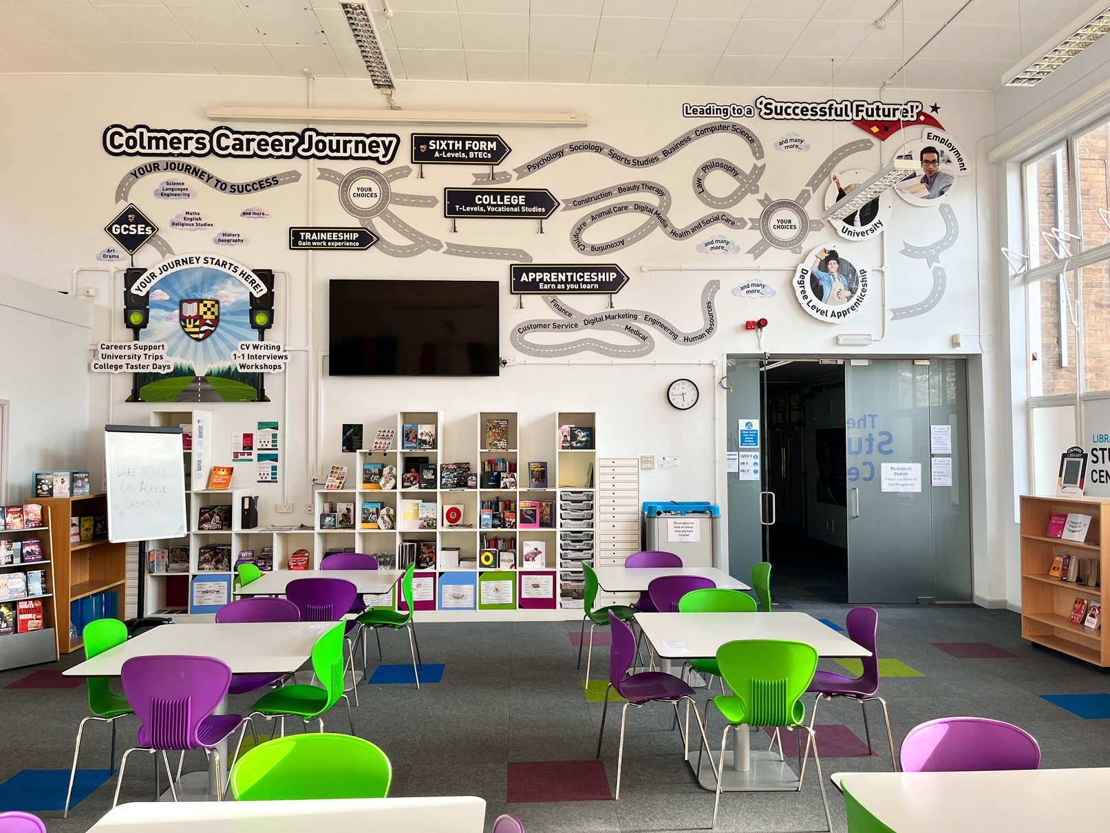
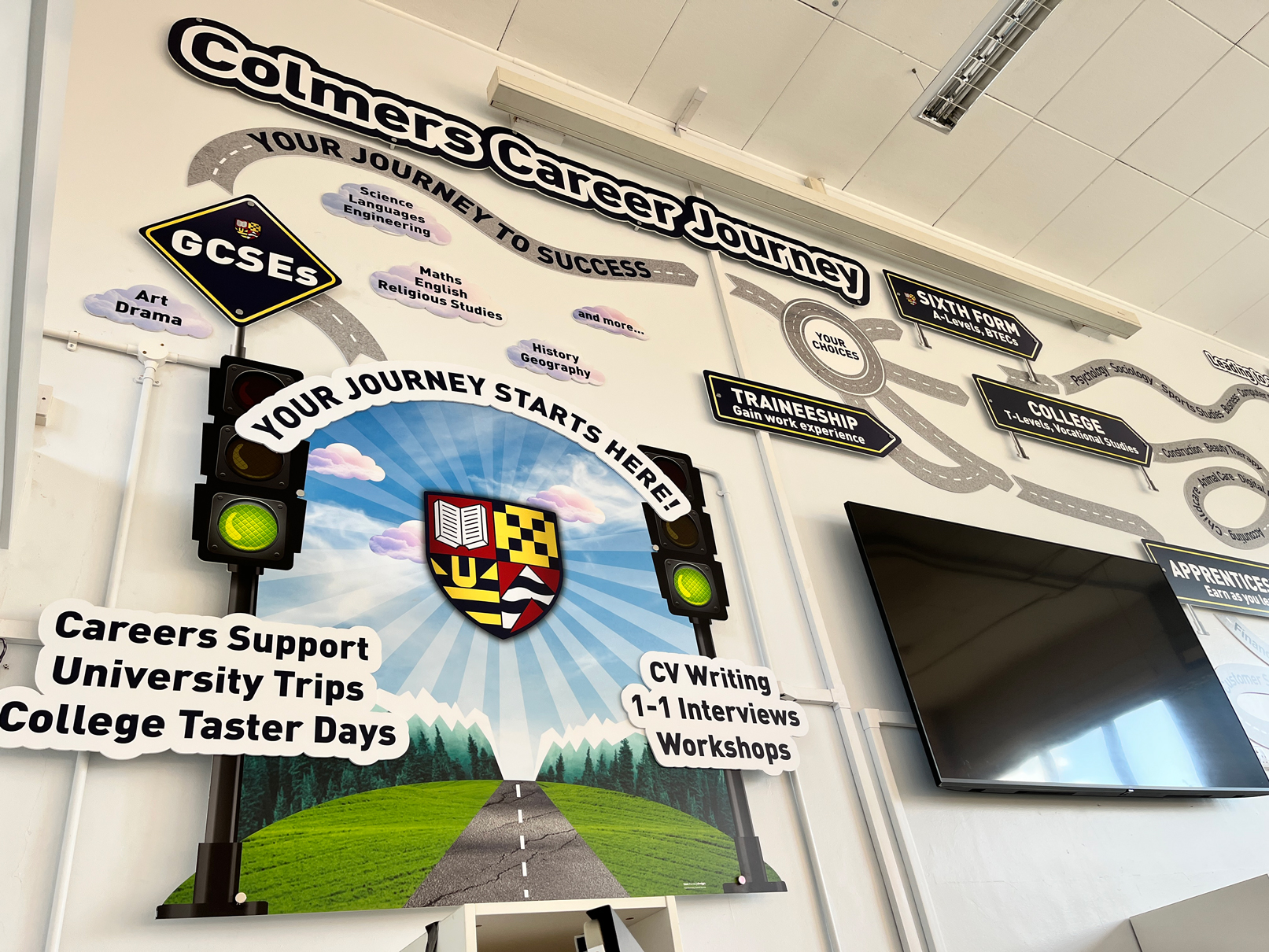
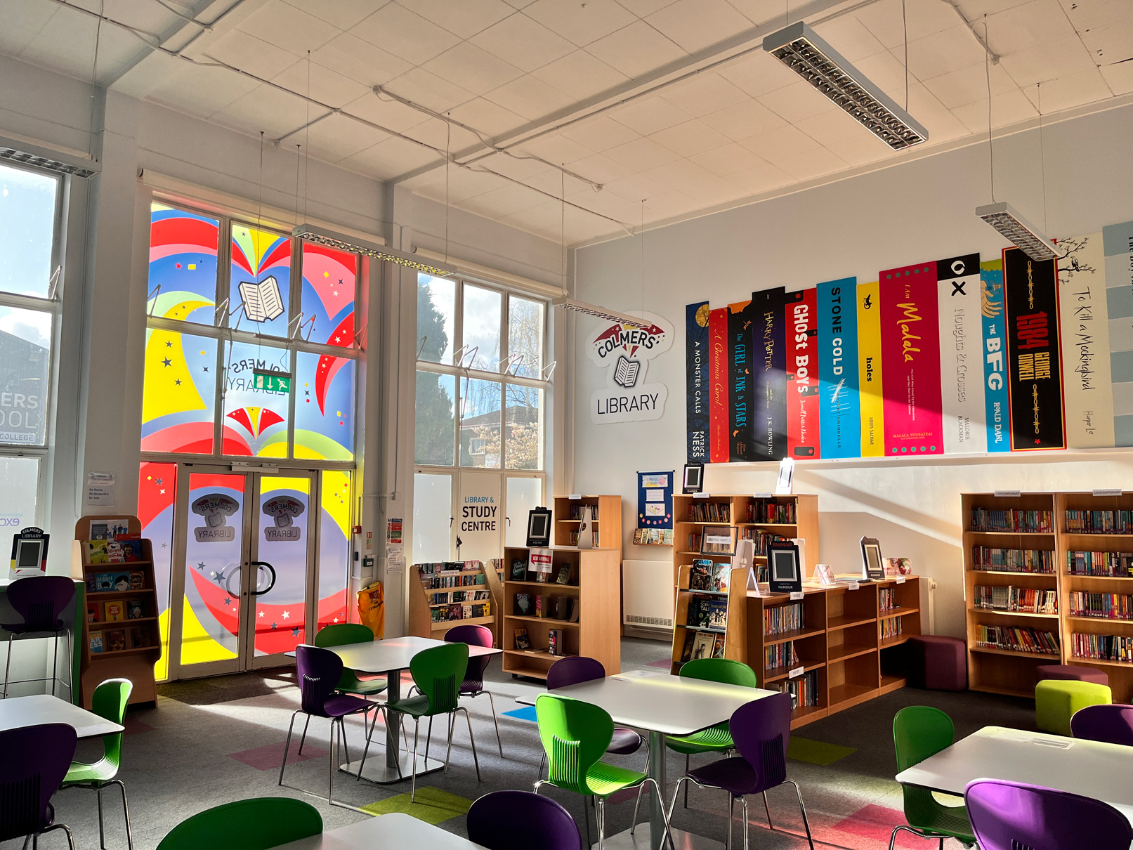
The brief: To create an identity for the school library reflecting the existing school brand. To create visuals that illustrate the Colmers Career Journey and promote reading across genres.
The process: Two Thirds Design were invited to the school to brainstorm ideas for the library. A large-scale wall display was created with sign-posts and text weaved throughout the display.
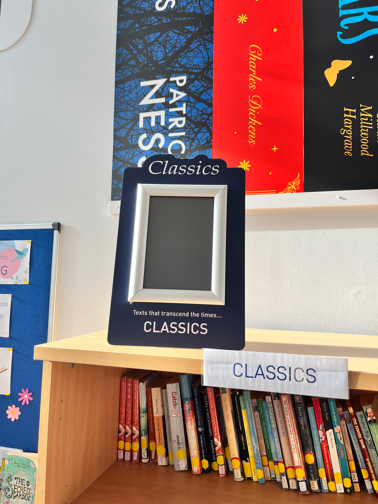
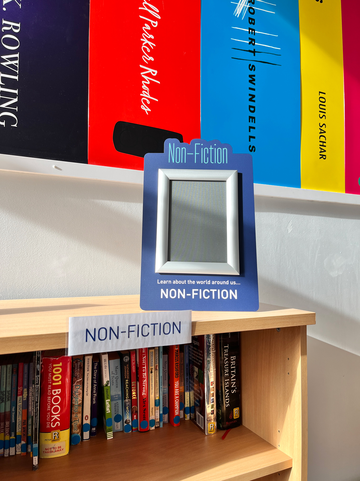
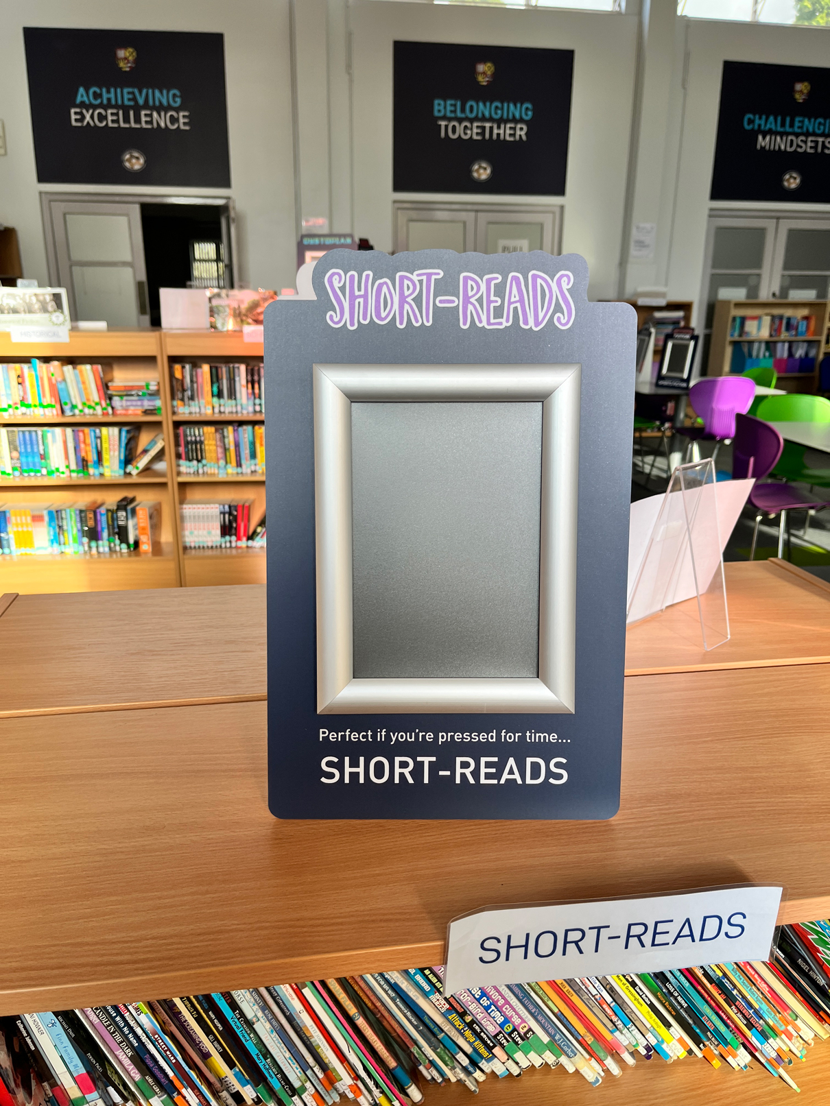
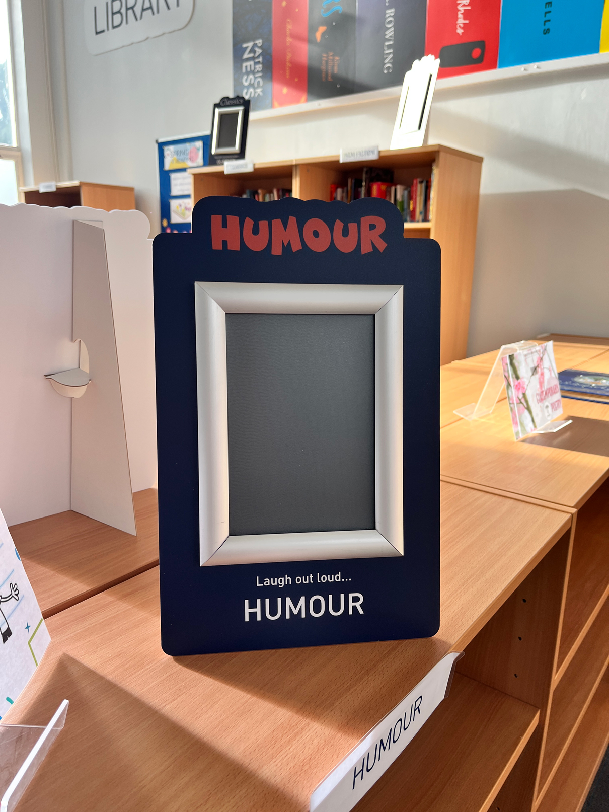
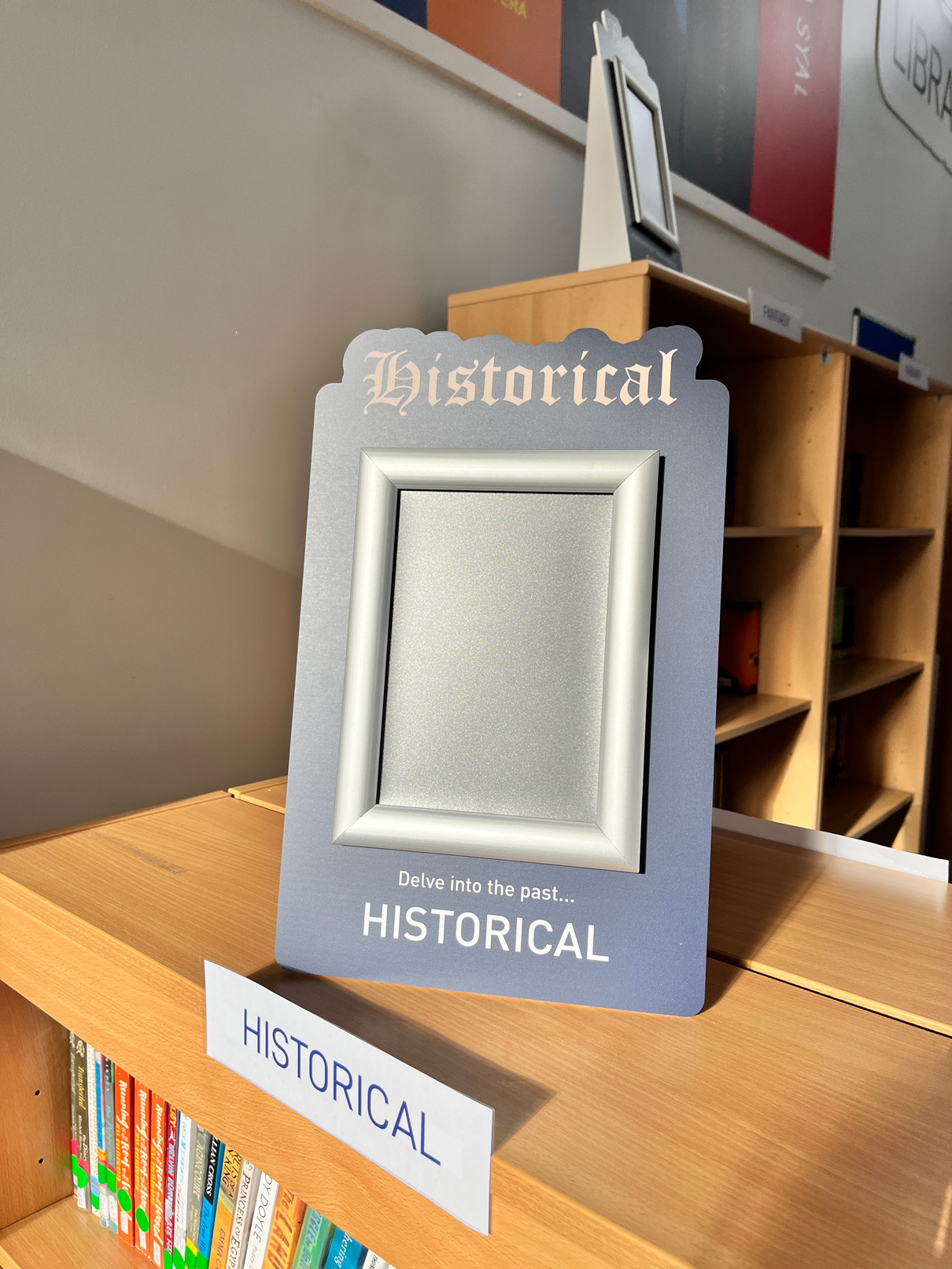
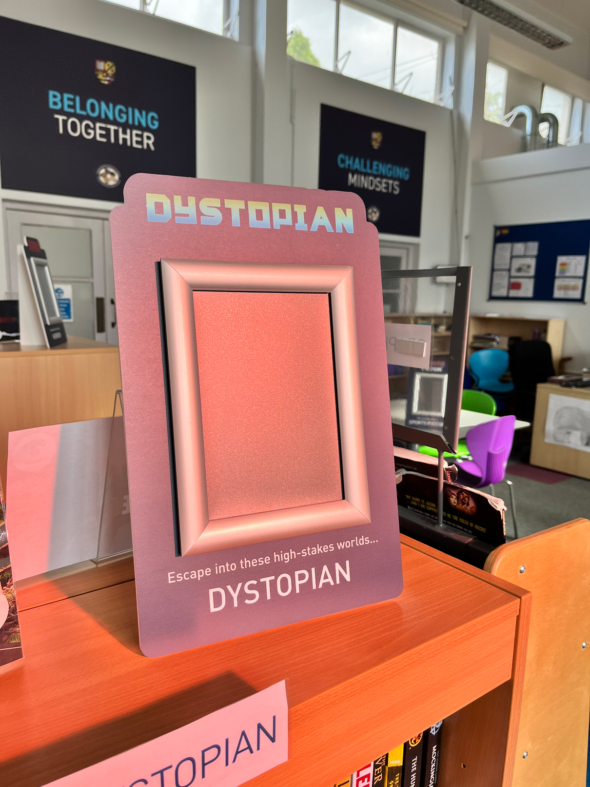
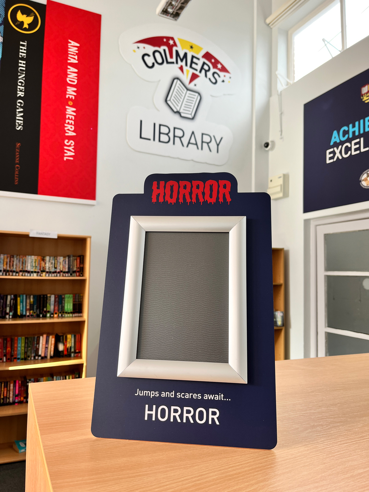
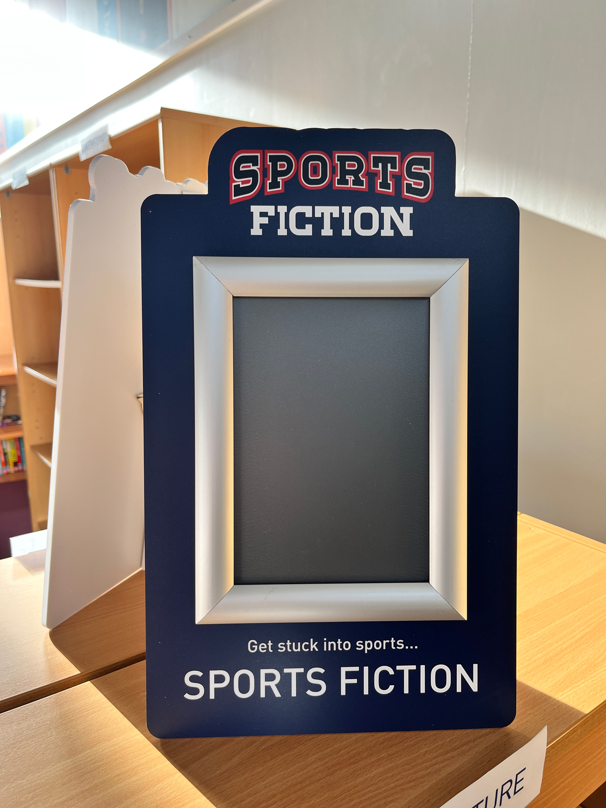
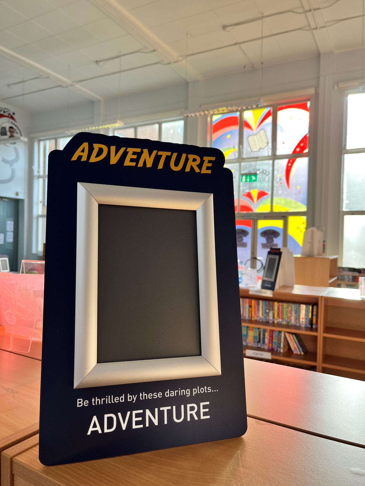
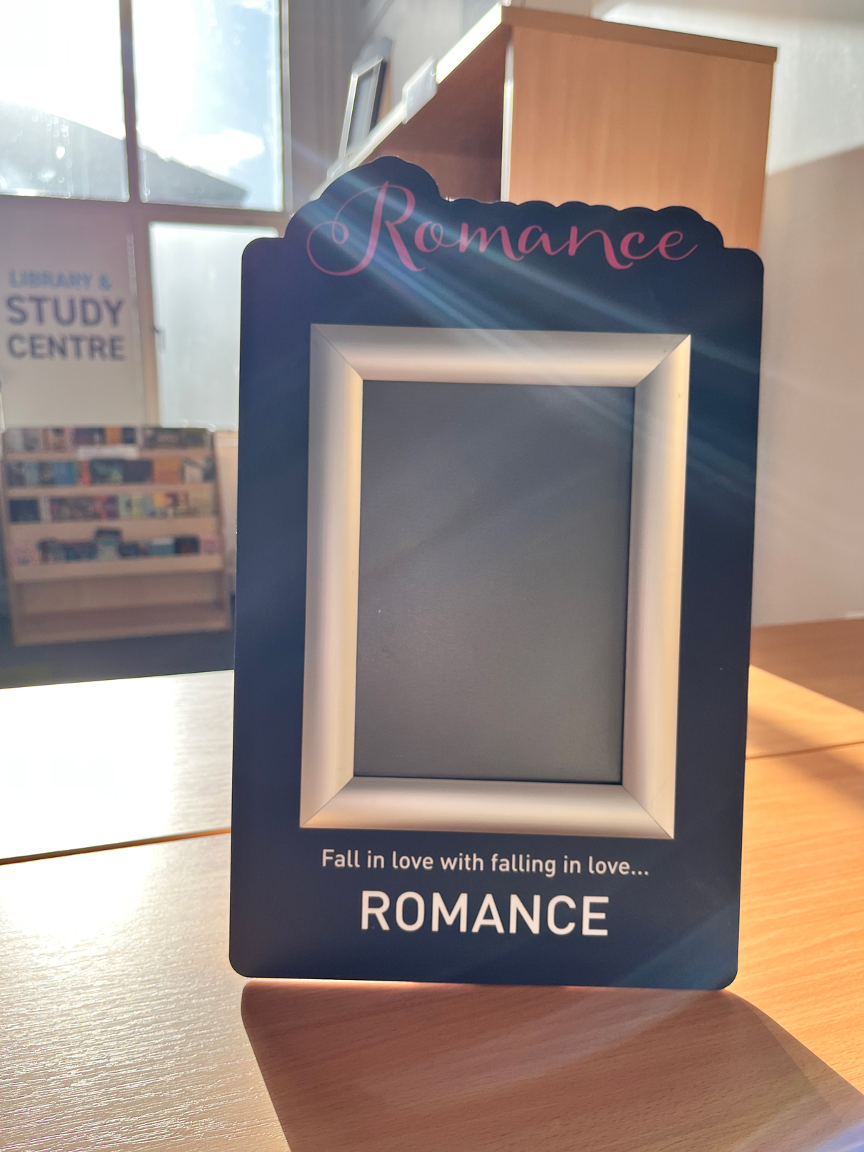
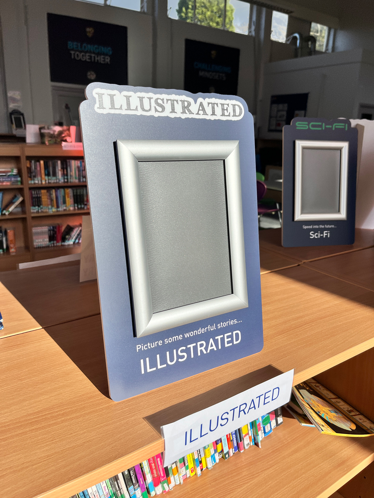
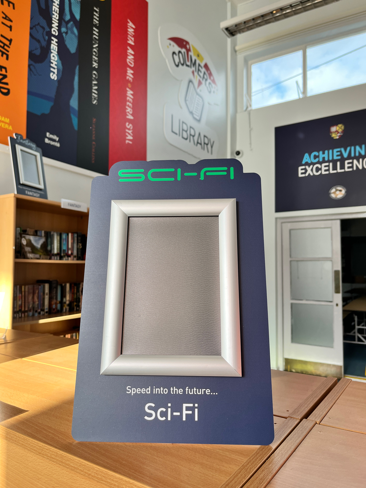
The end result: Logo boards were created, window vinyls were fitted to the glazed entrance and updatable book genre signage plaques were produced. One wall was covered with cut-to-shape boards that were bonded directly to the wall with others installed with stand-offs to brace trunking. This installation required scaffolding.
Client Colmers School and Sixth FormServices Branding, Design, Installation, Interactive, Print & Design Materials foamex, snap frames, Triple print vinyl Tags privacy, promote reading
